Lesson 5 - Creating Buttons
Upon completion of this unit, you should be able to:
- Create and edit rollover buttons.
- Make new buttons from an existing one.
- Use the library to add instances of a buttons.
- Add links to your buttons.
- Create a button from an existing graphic.
 Understanding Rollover Buttons Understanding Rollover Buttons
A button is simply an object that performs some action when you click it. Most Web pages contain buttons that direct you to other information on the Web.
In Macromedia Fireworks MX 2004, a button is a symbol that has its own frames, slice, and code to enable the button behaviors. You can use the drawing tools and the Button Editor to create new buttons, or you can make a button from an existing graphic.
A rollover button changes appearance when the user moves the pointer over or clicks the button. There are four common rollover states: Up, Over, Down, and Over While Down. Each state reflects a particular type of user interaction with the button: when the user is not interacting with the button, when the user moves the pointer over the button, when the user clicks the button, and when the user holds the pointer over the button on a page where that button is already depressed. A button will always have the Up and Over states; the Down and Over While Down states are optional.
In this lesson you first change the look of the button for each state. Then Fireworks creates the HTML and JavaScript needed to make the rollover work in your browser.
Creating a Rollover Button
When you create a button in Fireworks, your button appears in the Button Editor. This window contains tabs for each state and makes creating new buttons a cinch.
When you create a new button, it is added to the library automatically. You can then use it over and over again by placing instances of the same button throughout your document.
A simple rollover requires only two graphics: for the Up and Over states. In Step-by-Step 5.1, you create a simple rollover button.
-
STEP-BY-STEP 5.1
Creating the Up and Over States of a Button and Working in the Button Editor
- Start Fireworks and open the adventure5 file from the data files supplied with this course. Save it as adventure5, followed by your initials.
- Click the Window menu and then click Tile Vertical. (This will allow you to switch between the Button Editor and the Document window.)
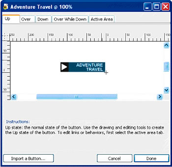
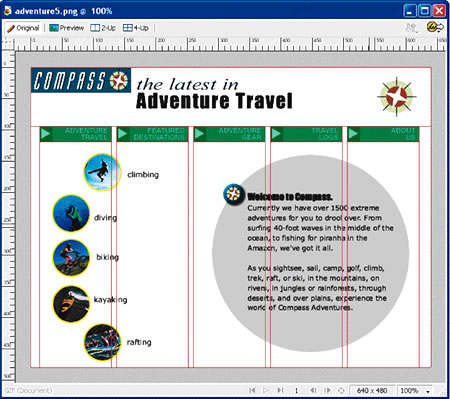
- Click the Edit menu, point to Insert, and then click New Button. This opens the Button Editor window. You might need to drag the. Button Editor window by its title bar so you can see the entire window. Figure 5-1 shows what the Up state will look like when you are finished drawing.
FIGURE 5-1:
Button Editor showing the finished Up state of the new button
- Click the Rectangle tool and draw a rectangle 115 pixels wide by 25 pixels high. (You can use the Property inspector to set or verify the size as you draw your rectangle.) Apply a fill color by sampling the color blue in the compass logo. (Hint: Click the Fill Color box, and then click the eyedropper on the blue color in the compass logo.)
- Add a smaller rectangle 21 pixels wide by 25 pixels high. Color the small rectangle dark gray, #333333. Click the Pointer tool and drag the smaller rectangle on top of the first rectangle.
Note:
If the Button Editor window is maximized, you might not be able to see the compass logo to sample its color. If this is the case, click the Window menu, and then click Cascade.
- Use Shift-click to select both rectangles. Click the Modify menu, point to Align, and then click Left to align the left edge of the second rectangle on top of the left edge of the first rectangle. Align their top edges as well.
- Select the Polygon tool (which is in the tool group with the Rectangle tool). On the Property inspector, click the arrow on the Shape box, and click Polygon. Highlight the value in the Sides box and enter 3. Highlight the value in the Angle box and enter 38. Set the fill color to white.
- Move the pointer within the Button Editor, hold down Shift to constrain the shape of the triangle, and drag to draw a triangle small enough to fit within the gray rectangle. As you drag, move the pointer around to position the triangle with one of the angles pointing to the right, as shown in Figure 5-1a.
- Click the Pointer tool and drag the triangle on top of the gray rectangle.
- Click the Text tool, click in the blue area of the rectangle, and key the name ADVENTURE (in all caps). Press Enter (Windows) or Return (Macintosh), and key TRAVEL (again, in all caps).
- Highlight the text you just keyed. On the Property inspector, format the text to size 11, Arial. Change the color to white, click the Bold button, and then click Right Alignment to align the text to the right. Make sure Horizontal scale is set to 100% and Kerning is set to 0.
- Using Figure 5-1 as a reference, position the text within the rectangle.
- Now, create the Over state of the button. Select the Over tab to create the rollover image. The rollover image is usually based on the original image, with perhaps just the color of the text or shade of the button changed.
- Click the Copy Up Graphic button in the Button Editor window to make a copy of the button you just created.
- Change the color of the triangle to red (#FF0000) and change the larger rectangle to dark blue (#000066).
- Select the Active Area tab. The Active Area tab displays a green translucent area-a slice-over the button and red slice guides. The slice contains all of the link information about your button, and the slice guides display the exact size and position of the slice.
The size of the slice is set automatically based on the size of all states of the button. You can deselect the Set Active Area Automatically option to manually change the size of the slice for the button. The slice triggers the rollover in the browser when the user rolls over the object on the page. If your buttons are small, you might want to make the slice larger than the button to give the user a larger target for activating the button. For now, stick with the current settings.
- Click the Done button at the bottom of the Button Editor window. Your button is visible, and you see the slice (a green translucent overlay) and the red slice guides. The slice guides are very helpful for placing other buttons on the page relative to this first one. The slice guides also determine the cells for the HTML table that is created if you export and save as an HTML file.
If the guides are not visible, click the View menu and then click Slice Guides to display them. If the slice is not visible, click the Show Slices and Hotspots button on the Tools panel, as shown in Figure 5-1b. Remain in this screen for the next Step-by-Step.
FIGURE 5-1b:
Web section of the Tools panel

Modifying and Previewing a Rollover Button
You can modify a button by double-clicking it and making changes to it in the Button Editor. You can also preview how your button will look on the Web page by clicking the Preview button (Windows) or tab (Macintosh) in the Document window.
-
STEP-BY-STEP 5.2 Modifying and Previewing a Button
- Click the Pointer tool, and then double-click the Adventure Travel button to open the Button Editor. You can make changes to your button in the Button Editor. Remember that you have two images: the Up state and the Over state. Changing one does not automatically change the other-they are separate images. If you change the size of the first button, you might want to delete the rollover image and re-create the Over state of the button.
- Click Cancel to close the Button Editor without making any changes.
- Click the Preview button (Windows) or tab (Macintosh) in the Document window to view your button.
- Move the pointer over the button to see the rollover image.
- Click the Original button (Windows) or tab (Macintosh) to return to the Document window.
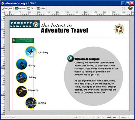
- Click the Pointer tool and move this button above the climbing button, as shown in Figure 5-2. Remain in this screen for the next Step-by-Step.
FIGURE 5-2:
Final position of the Adventure Travel button
Using the Library Panel
The reusable objects stored on the Library panel are symbols. There are three types of symbols: graphic symbols, button symbols, and animation symbols. Once you add a symbol to the Library panel, you can place copies of the symbol-called instances-in your document. When you create a new button, Fireworks stores it in the library. You can then use the button over and over again by placing instances throughout your document. The library stores the master copy of your button, so if you make a change to the button, every instance of the button will be updated automatically. You can also use the Library panel to duplicate buttons and edit the copies to make new buttons based on an existing design.
In this task you use the Library panel to rename the button you just created. Then you make four new buttons based on the original.
-
STEP-BY-STEP 5.3: Working with Buttons
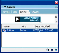
- Click the Window menu, and then click Library. The Library panel moves to the foreground. The Library panel contains one button, as shown in Figure 5-3a. (If you don't have a good view of the Library panel, you can undock it or collapse some of the other panels.)
FIGURE 5-3a: Library panel
- Double-click the button name, Button (one of the three types of symbols in Fireworks). The Symbol Properties dialog box opens.
- Change the name of the button to Adventure Travel and click OK.
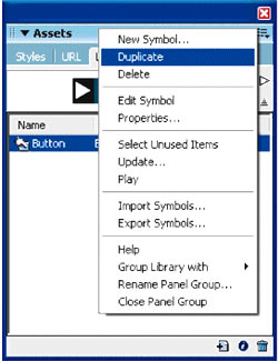
- Click Duplicate on the Library Options menu, as shown in Figure 5-3b. This creates a new button named Adventure Travel
FIGURE 5-3b:
The Duplicate command on the Library Options menu
- Double-click Adventure Travel 1, rename it Featured Destinations, and click OK. Now you need to edit the new button.
- With the Featured Destinations button still selected, double-click the preview of the button at the top of the Library panel. This opens the Featured Destinations Button Editor window.
- Click the Text tool, highlight the label (ADVENTURE TRAVEL) on the button, and change the label to FEATURED DESTINATIONS (key the label in all caps, and remember to press Enter or Return after the word "FEATURED"). Click outside the text box. A message box opens, asking if you want to update the text in the other button states.
- Click Yes and then click Done. You've just created a new button based on the original.
- Follow steps 4 through 8 to add three more buttons. Name them Adventure Gear, Travel Logs, and About Us. Change the labels of the buttons to ADVENTURE GEAR (press Enter or Return after "ADVENTURE"), TRAVEL LOGS (press Enter or Return after "TRAVEL"), and ABOUT US (press Enter or Return after "ABOUT").
Hot Tip:
When editing the buttons, be sure to click outside the text box and click Yes to update the text in all button states. Then click Done.
When positioning the new buttons, first position them approximately where you want them. Then select all five buttons. Click the Modify menu, point to Align, and then click Top, or click the Modify menu, point to Align, and then click Distribute Widths.
- To add the new buttons to the document, drag them from the Library panel to the canvas. Position them as shown in Figure 5-3c. Save the document and remain in this sc or next Step-by-Step.
FIGURE 5-3c: Completed buttons
Establishing Links
The buttons you've created look great, but after you export the file, clicking your buttons doesn't do anything. You still need to set up your links. After all, the purpose of a button is to link to another HTML page. You could set up the links in another program such as Macromedia Dreamweaver MX 2004, but you can also take care of the links right in Fireworks.
-
STEP-BY-STEP 5.4: Linking Buttons to HTML Pages
- Select the ADVENTURE TRAVEL button. Make sure it's the only object selected.
- Click in the Link box on the Property inspector and key the complete path name for the data file travel.htm (you may need to ask your instructor for the complete path name). Now when you export the file and click the Adventure Travel button, it will open the travel.htm Web page. You can also link to pages stored in other directories or to other URLs on the Web.
- Click in the Alt box and then key Adventure Travel. The Alt box is used to create an alternative text description of the button for display in a browser.
- Repeat steps 1 through 3 to establish links for the remaining four buttons. Use the following links: FEATURED DESTINATIONS button links to featured.htm, ADVENTURE GEAR button links to gear.htm, TRAVEL LOGS button links to logs.htm, and ABOUT US button links to about.htm. Use the button labels as the alternative text descriptions. Remain in this screen for the next Step-by-Step.
Note: In some browsers, the Alt text appears while the image is loading. In browsers that do not display images, the Alt text might appear in place of the image. Alt text is also read by screen readers. Omitting Alt text can make your buttons and images inaccessible to visitors to your site who use screen readers.
Converting Graphics to Buttons
So far, you've seen how how easy it is to creater a new button by using the Button Editor. But you can also turn your existing graphics into buttons. For example, the Adventure Travel Web page contains five graphics representing different types of adventures, such as rock climbing and diving.
Right now, these are bitmap graphics. If you click them, the Property inspector displays bitmap options. In other words, they're not buttons, and you can't use them currently to link to another HTML page. However, you can fix that if you convert the graphics to Fireworks buttons.
-
STEP-BY-STEP 5.5: Converting Graphics to Buttons
- Select the climbing graphic. You can tell by the selection border that the graphic is much larger than it appears. This means you will probably need to adjust the active area of the button.
- Click the Modify menu, point to Symbol, and then click Convert to Symbol. The Symbol Properties dialog box opens.
- Key Climbing, click the Button option, and click OK. The graphic is converted to a button, the Property inspector displays button options, and a copy of the new button is added to the Library panel.
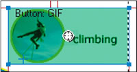
The large green area tells you that the slice for this button is much larger than it needs to be. You want the active area for this button to include the circle and the text to the right of the graphic. You also want the button to change when the user rolls over the image to show that it's a button.
- Double-click the button to open the Button Editor.
- Click the Over tab and click Copy Up Graphic.
- Make sure the climbing graphic is selected. In the Layers panel, click the thumbnail next to the label "Bitmap." The Property inspector,,now shows the properties for a vector mask.
- In the Property inspector, change the stroke color of the yellow circle to green, #OOFF00.
- Click the Active Area tab and deselect the Set Active Area Automatically option.
- Drag the top slice guide to the top edge of the circle. Drag the bottom slide guide to the bottom edge of the circle. Drag the left slice guide to the left edge of the circle. Drag the right slice guide about one inch to the right edge of the circle. The width of the slice should be approximately 130 pixels. Then click Done. The slice should now look like Figure 5-5a.
FIGURE 5-5a: Edited slice
Note: If your slice did not adjust, you probably did not deselect the Set Active Area Automatically option in step 8. It's an easy step to miss.
- On the Property inspector, link the climbing button to the climbing.htm file included in the data files supplied for this course. Be sure to key the complete path name for the file in the Link box, and key the button label Climbing in the Alt box.
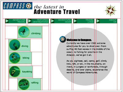
- Convert the four remaining circular graphics to buttons with green Over states and link them as follows: the diving button links to diving.htm, the biking button links to biking.htm, the kayaking button links to kayaking.htm, and the rafting button links to rafting.htm. Provide the alt text for each button. Your document should look like Figure 5-5b.
FIGURE 5-5b:
The completed adventure5.png file
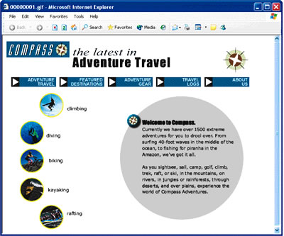
- Click the File menu, point to Preview in Browser, and select your default browser. You can now see what the file will look like when exported as HTML and viewed in your default browser. It should look similar to Figure 5-5c.
FIGURE 5-5c:
The completed adventure5 file previewed in a browser
- Close the browser window to fetorn to the document.
- Save and send the adventure5 file to the teacher.
 Back to Lesson 4: Text, Masks and Live Effects Back to Lesson 4: Text, Masks and Live Effects
 Go to next section: Lesson 6: Optimizing and Exporting Go to next section: Lesson 6: Optimizing and Exporting
|
