|
 Design Tips: How to avoid the common
mistakes of new designers
Design Tips: How to avoid the common
mistakes of new designers
 Compare
these two Web sites for the Pitts Choir: site
1 | site
2 Compare
these two Web sites for the Pitts Choir: site
1 | site
2
What's the difference?
Which one is better? Why?
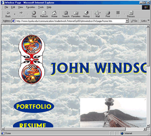
Problem #1: Everything Is Too Big
Frequently, new designers use oversized
text in their copy and graphic navigation buttons that take
up too much space. Although this can be suitable for a personal
page, it is generally considered the mark of an amateur
designer.
Remember, screen real estate
is very valuable-- don't waste space by making your design
elements too big. Spend time looking at navigation and interface
design of professional Web sites, and you'll see that oversized
graphics and text are unnecessary.
.
Problem #2: Site only looks acceptable
when viewed at high resolution on a large monitor (i.e.
the monitors in our lab).
Give your site this test: Change the
browser size of your page and see if your main elements
still look okay. If you have a computer in your room, then
try changing the resolution display. (Right-click on the
desktop and choose Properties, then go to settings and change
the resolution to another setting.)
Does the site still look okay?
Problem #3: Inconsistency
It's amazing how much our eyes desire
order. There are a few techniques that you can employ to
make your site clean and consistent.
Keep things the same size:
Photos:
If you have several photographs on one page, make smaller
thumbnails that are exactly the same size so people can
click to view the larger photograph.
Examples: Pitts Choir
| Mockup
Site
Navigation:
Keep the text the same size. If you have one button that
has a word that's too long, shorten the word or make all
of the text smaller. Also, keep the position of the navigation
elements consistent on each page. Buttons shouldn't shift
as you click throught the site.
Examples: Pitts
Choir 1 | Pitts
Choir 2
Problem #4: Copy
Don't center your text. Keep it aligned
to the left and keep it in the same position on each page.
Don't mix text sizes, and use the same
font throughout your copy.
Don't use bold for page copy, it is
difficult to read.
Unless your target audience is senior
citizens, do not use oversized copy in your site. Regular
copy is size 3.
| size 1 |
size -2 |
too small |
| size 2 |
size -1 |
sub-text |
| size
3 |
none |
DEFAULT |
| size 4 |
size +1 |
heading |
| size 5 |
size +2 |
large heading |
| size 6 |
size +3 |
too big |
| size 7 |
size +4 |
too big |
Problem #5: Resizing Photos
It's very obvious when you change the
dimensions of an image in the HTML page. It makes the image
appear slightly mishapen or blurry. If you want your image
to be bigger or smaller, then open the image in Fireworks,
resize it (Modify-->Canvas-->Image Size and enter new dimensions),
and then resave it. Then insert the image in your page again.
Problem #6: Sloppiness
Look at your page very carefully! Make
sure things line up, are the same size, are spelled correctly,
and do not overlap with other elements.
Dreamweaver has a spell check function,
go to Text-->Check Spelling
Title your pages! (You should not have
any pages that are Untitled.)
And again, don't resize your images
in Dreamweaver!
|