|
 How Web Design is Different from
Print Design
How Web Design is Different from
Print Design
Once a publication like a magazine or
newspaper is produced, every one is pretty much guarenteed
to see the pages the same way. The Newsweek that you browse
in the library is going to have the same spacing, text size,
font, colors and layout as the one that is delivered to
your home. With the Web, there are no guarentees that people
will see your pages the same way you desigmed them on the
screen.
 Page
Layout is Not Necessarily Under the Designers Control Page
Layout is Not Necessarily Under the Designers Control
 Resolution
and Monitor size Resolution
and Monitor size
Computers have different resolution
settings which specify in pixels how much viewing area is
displayed. Usually, larger monitors are set to higher resolutions
because there is more screen area, but this is not always
the case. A certain size monitor does not guarentee that
a user has their resolution set to a particular setting.
Laptops, although smaller than desktops, are usually set
to higher resolutions so they can accomodate more space
within a smaller screen.
- 640 x 480
- 800 x 600
- 1024 x 768
- 1152 x 864
- 1280 x 1024
- 1600 x 900
- 1600 x 1024
- 1600 x 1200
- 1600 x 1280
|
<
See how resolution
affects the display >
example
|
|
 Browsers Browsers
There are many browsers out there besides
Explorer and Netscape, such as AOL browsers, WebTV users,
and those accessing the Web from
handheld devices like Palm Pilots and cell phones.
But even if
we just considered the few dominant browsers, there are
still dozens of versions of each, once you take into account
all the different releases and the various platform versions
of each.
 Platforms Platforms
Mac and PC display Web sites differently.
The same type size will appear larger on a Windows PC than
on a Macintosh computer. If you set your type on your Web
page to be small on your Windows machine, it may be completely
illegible for Mac users. Colors will also display differently.
To ensure cross-platform color support, you must design
your site with Web safe colors.
  User
Preferences User
Preferences
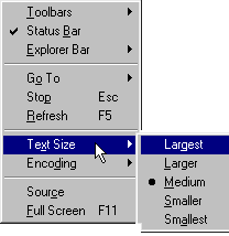
Users have the ability to customize
their browsers, and can change the way information is displayed
on their screen. They might choose, for example, not display
any graphics, or to display all text in Arial or Helvetica
font. Users can also choose font size and link colors.
Window size, connection speed, computer
speed, and color settings further affect the users' experience.
 File
Size Matters File
Size Matters
It is not too often when
we pick up a magazine and exclaim to our friends, "Wow,
that file must be over 100 megabytes!" Who cares how
big the file is after something is printed? The Web is obviously
quite different. For users accessing by modem, file size
is difference between a twenty second or a five minute wait.
For this reason, it is important to take great care in optimizing
your images.
 The
Web is Non-Linear The
Web is Non-Linear
Visitors access each page
by hypertext links-- from another page on your site, or
from anywhere on the Web. The Web is about letting the visitor
choose her or his own path through the information. You
don't want to trap visitors with dead-end links-- pages
that don't go anywhere. In this site, javascript pop-up
windows are used to display content that is an example page
with no links to outside pages. You need to remember to
title each one of your pages, because as they say, "every
door could be front door" -- you cannot trust that
your visitors will visit your splash page or home page first,
so make sure that inside pages provide some context indicating
where exactly you are.
 HTML's
Capabilities are Changing all the TIme HTML's
Capabilities are Changing all the TIme
HTML's creators weren't
thinking of commercial online art galleries or snowboarding
sites with sophisticated interactivity when they defined
the basic tags. What they acheived was a way of navigating
through information on the Internet using a system of easy-to-use
and easy-to-learn hyperlinks. The first tags consisted of
six heading levels, one standard and one monospaced font,
numbered and bulleted lists, footnotes, indented quotes,
bold and italic text, and the anchor tag for hyperlinks.
When the World Wide Web
took off in popularity, there was suddenly much demand for
more capabilities. Other tags were added to newer HTML specifications,
such as tables, frames, background colors, text-wrap around
graphics, and style sheets for precise control.
When it comes to the Web,
the learning curve is constant. Web professionals need to
constantly keep up with the HTML specifications of new browsers
to take advantage of new possibilities.
|
