|
 What is an interface?
The "interface"
is the means by which we access information and interact
with the system. On the Web, the interface is the graphical
or textural design or layout that users interact with to
access the information within the site.

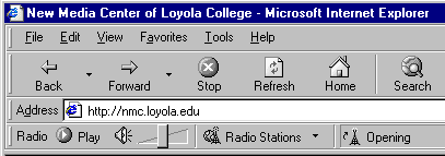
The browser is the interface
to the Web; a tool to access Web sites

 Look
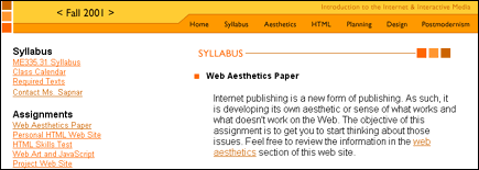
at different kinds of interfaces Look
at different kinds of interfaces
 Factors that contribute to an effective
user interface
As a result of information
overload, web designers have to become much more user-oriented
and provide updated information in a timely manner to attract
traffic to their server.
In designing web media,
web developers need to be aware of the various factors that
contribute to an effective user interface. These factors
include:
 Load
Efficiency Load
Efficiency
Current bandwidth issues, such as
modem speed and access providers' connection speed contribute
to the efficiency of information retrieval from web
media. In developing your site you need to be aware
that not all users have fast modems or speedy access
points. Try not to present your information in one extremely
large page; instead, break it up into smaller pieces
or pages making it easier for the user to load your
information efficiently. Be careful not to break it
up so much that users are constantly clicking, and wishing
they could retrieve everything at once. Other issues
to consider include document or element file size and
bit depth/ compression of your imagery. If you include
large, uncompressed image files, you could potentially
lose a user to excessive load time.
 Easily
Readable Pages Easily
Readable PagesDevelopers also need to be aware of the
various design elements included in their web media. Try not
to incorporate too many elements (i.e. multiple fonts, javascript
overload, animated gifs, etc.) or haphazard, unorganized information
(i.e., imagery and text all over the place), or excessive
mixing of these elements (i.e., loud, overly-textured backgrounds
making text unreadable).
 Cross
Browser Support Cross
Browser Support
Another consideration is making sure
that your information is available to multiple users. Be
aware of the various browsing environments available to
users. A page loaded in Netscape will not look the same
on a page loaded in Microsoft's Internet Explorer. Taking
the careful time to configure your information for a particular
platform will be fruitless. Testing your site in various
browsing environments throughout the development process,
will give you the opportunity to see how others see your
information and to make sure that it is formatted correctly.
You should consider offering a modified or text-only version
for other browsing environments.
 Clear
Navigation and Consistent Cues Clear
Navigation and Consistent Cues
Not everyone will know that
the little rubber ducky on the side of your screen
will take you to software, or that the bottlecap
that you meticulously crafted links to a section
about the history of the organization. You have
to make these things apparent. The user never likes
to feel stupid.
Although you can't control the users'
behavior or browsing environment, you can make the trip easier
to navigate. Be aware of false or inappropriate cues, such
as "go back" or "go forward." You want
to avoid this linear style of navigation because the truth
is, you don't know where your visitor entered the site. In
the virtual world, every door is potentially the front door.
Not everyone may understand the symbology or imagery you might
choose to use for your site. Unless the context for how these
pieces are being used has been clearly stated, you run the
risk of confusing or losing a user. One way to help orient
users is to offer navigational tools such as menu bars or
running links on every page. These tools allow users to get
your information from a cohesive and consistent source, in
the order they wish to retrieve it.
 Usability Usability
A good way to analyze the performance
and structure of your site is to conduct a usability
test on the site. How easy is the site to use? After
spending a few weeks designing, it's easy to think
your site is simple to navigate and the cached images
load quickly. Test it out on other people, other browsers,
your roommates, parents-- whoever's scrutiny you can
enlist for your cause.. Have them check for load time,
page readability, and if navigation cues function
well.
 What Users Agree On
 People
have very little patience for poorly designed sites. The
more well-organized a page is, the more faith they will
put in the content. Also on the user hate list are server
error messages and under construction signs. Don't put
something up if it isn't finished. People
have very little patience for poorly designed sites. The
more well-organized a page is, the more faith they will
put in the content. Also on the user hate list are server
error messages and under construction signs. Don't put
something up if it isn't finished.
 Users want to be able to find
the information they came for as quickly as possible.
Make topics easily accessible from the first page, so
there isn't wasted time and frustrating confusion clicking
from screen to screen in vain. Make sure that the information
available is highly structured and organized. There is
an art to information architecture.
 Users
don't want to read: Not only are reading speeds 25% slower
on screen than on paper, web users overall would prefer
to have information visually illustrated. Tables, graphs,
and bullet lists are preferred to straight text. Also,
most users recklessly skip over any welcome messages and
introductory paragraphs, and head right for highlighted
terms or hyperlinked text. Users
don't want to read: Not only are reading speeds 25% slower
on screen than on paper, web users overall would prefer
to have information visually illustrated. Tables, graphs,
and bullet lists are preferred to straight text. Also,
most users recklessly skip over any welcome messages and
introductory paragraphs, and head right for highlighted
terms or hyperlinked text.
|

